Printing Workshop - Screen Printing - Development
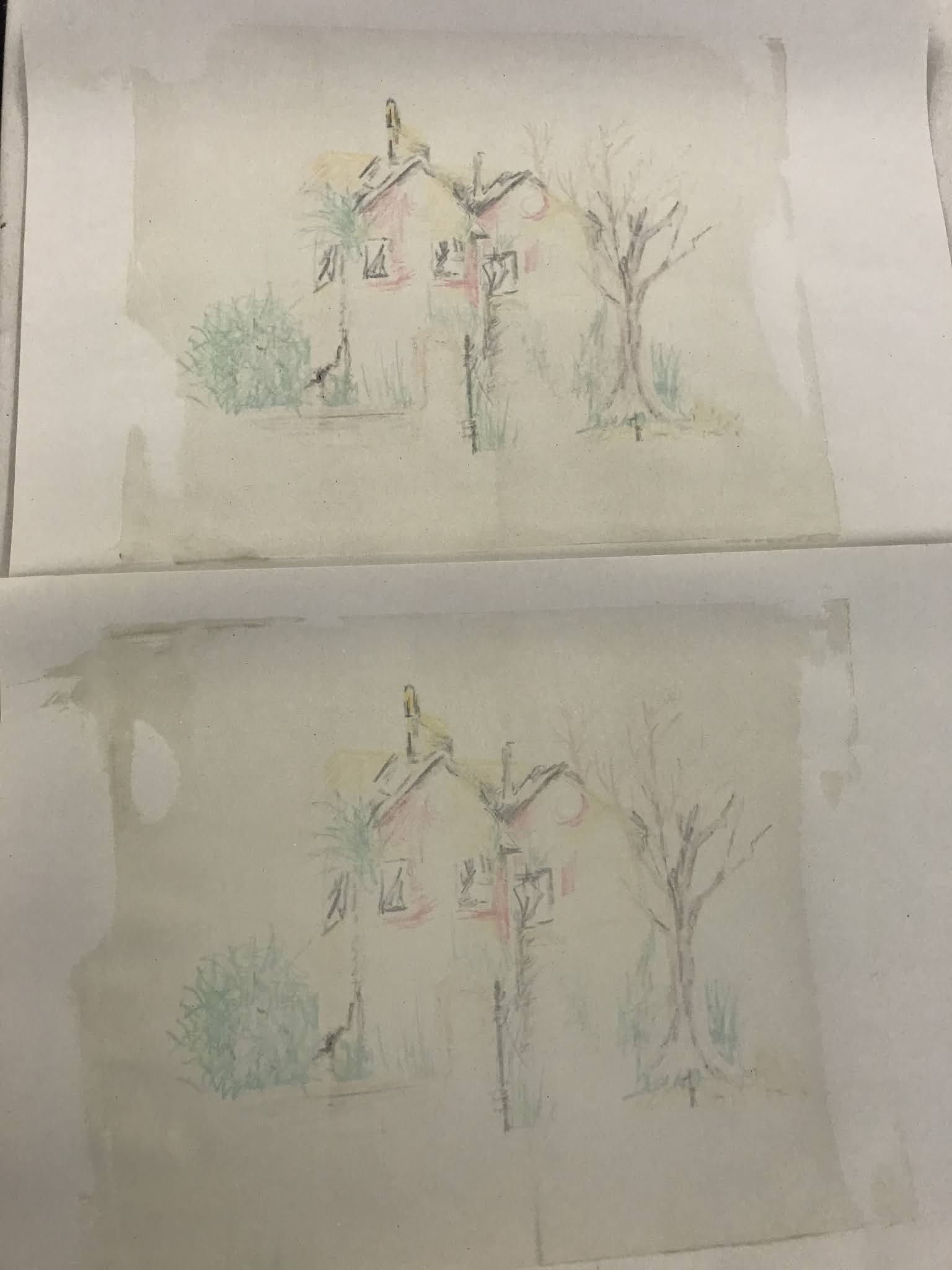
I had not planned to do screen printing for the House project, I was going to do it for the hospital project. However, I had taken some water soluble crayons with me to the print room (with the idea of adding colour to my drypoint). Damian the technician suggested we try a process with the crayons and a non colour print medium. The idea was to draw your image directly onto the screen and use the clear medium to seep through the screen and transfer the colour on to the paper.
We had never tried it before but wanted to give it a go, we had no idea how it would turn out.
The process worked well. Each printing of the image was lighter in colour density. The first image being the strongest and the each time the image faded a little more. This process worked well with my idea of the house fading from memory, fading from existence. I printed about 10 sheets until there was only the tiniest hint of the image. I feel this was a successful process which I enjoyed the outcome. I think I would spend more time of the initial drawing of the image given the chance again. I wanted it to look like an abandoned house, broken windows, damage to the roof, overgrown vegetation. The image was scratchy and I tried to use John Piper style colours which are mid century style, mustards, turquoise, navy, red. I love this colour palette and I chose an off white paper rather than stark white to give it the mid century feel.
I included in the image the gate post. The gate posts of the House still stand so I know them well. I do have images of them from many years ago but I can't find them. When I can visit Manchester I will take photographs of them again.
 |
| The whole collection of printed images, showing the House fading in the away (2021) |


 |
| Showing how each image reduced in the process |


Comments
Post a Comment